PowerTip is a jQuery tooltip plugin with a smooth user experience that features a very flexible design which is easy to customize, gives you a variety of different ways to create tooltips, supports adding complex data to tooltips, and has a robust API for developers seeking greater integration with their web applications.
Examples
Here are some basic examples of PowerTip in action. You can also fiddle with PowerTip on the official JSFiddle demo.
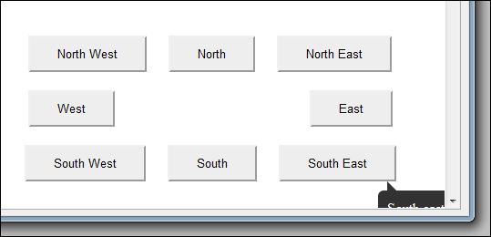
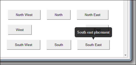
Placement examples
Mouse follow example
Mouse on to popup example
Overview
Unique Features
-
Checks for hover intent
Testing for hover intent makes it so that tooltips don’t open the moment your mouse happens to cross an element with a tooltip. Users must hover over the element for a moment before the tooltip will open. This provides a much smoother user experience.
-
Tooltip queuing
The tooltip queue makes it a fundamental rule of the system that there will only ever be one tooltip visible on the screen. When the user moves their cursor from one element with a tooltip to another element with a tooltip, the previous tooltip will close gracefully before the new tooltip opens.
Features
- Straightforward implementation
- Simple configuration
- Supports static tooltips as well as tooltips that follow the mouse
- Ability to let users mouse on to the tooltips and interact with their content
- Mouse follow tooltips are constrained to the browser viewport
- Easy customization
- Works with keyboard navigation
- Smooth fade-ins and fade-outs
- Smart placement that (when enabled) will try to keep tooltips inside of the viewport
- Multiple instances
- Works on any type of element
- Supports complex content (markup with behavior & events)
- Supports custom open and close event handlers
Requirements
- jQuery 1.7 or later
Important note: The <body> tag must use the default CSS position.
Design Goals
-
Tooltips that behave like they would in desktop applications
Tooltips should not flicker or be difficult to interact with. Only one tooltip should be visible on the screen at a time. When the cursor moves to another item with a tooltip, then the last tooltip should close gracefully before the new one opens.
-
Fade-in and fade-out
The tooltips will have smooth fade-in and out cycles instead of abruptly appearing a disappearing. The fade effects should not conflict with any other effects in the document.
-
Check for hover intent
Tooltips should not suddenly appear as soon as the mouse cursor happens to cross the element. They should only open when the cursor hovers over an element for a moment indicating that the user is actively focused on that element.
-
Support multiple instances
Support various kinds of tooltips in one document, each with their own settings and content, even with different tooltip divs and styling. All while still preserving the one-tooltip rule and behaving like one instance.
-
Totally portable
The plugin will not require any other plugins or extensions to function. There will be no dependencies other than the core jQuery library. The plugin will not require any images, all layout will be entirely CSS based.
-
Easy to use
Despite all of the complexity involved (timers, animations, multiple instances), the plugin should be very simple to use, requiring little to no configuration to get running.
-
Easy to customize
Tooltip layout and functionality should be extensible and simple for developers to adapt to match their web sites. Layout will be done entirely with CSS and the plugin will not attach any inline styles other than to control visibility and positioning.
Installation
The first step for using this plugin in your project is to include the needed files.
Manual installation
The most direct way to install this plugin is to download the latest version from the project page and copy the necessary files into your project. At the very least you will want one of the js files and one of the css files.
npm Installation
This plugin has been published to npm as jquery-powertip. This means that if you are using npm as your package manager then you can install PowerTip in your project by simply adding it to your package.json and/or running the following command:
npm install jquery-powertip --save
Then you can include it in your pages however you like (HTML tags, browserify, Require.js).
Including resources
HTML
Once the PowerTip files are in your project you can simply include them in your web page with the following HTML tags:
<script type="text/javascript" src="path/to/jquery.powertip.js"></script>
<link rel="stylesheet" type="text/css" href="path/to/jquery.powertip.css" />
Important note: Make sure you include jQuery before PowerTip in your HTML.
Browserify
PowerTip supports the CommonJS loading specification. If you are using npm to manage your packages and Browserify to build your project, then you can load it and use it with a simple require('jquery-powertip').
The PowerTip API will be loaded into jQuery as well as the return object from the require().
Important notes: You will still need to include the CSS in your web page.
RequireJS
PowerTip also supports the AMD loading specification used by RequireJS. You can load and use it by adding the path to your paths configuration and referencing it in your define() call(s).
Example paths configuration:
require.config({
	paths: {
		jquery: 'https://code.jquery.com/jquery-3.6.0',
		'jquery.powertip': '../dist/jquery.powertip'
	}
});
The PowerTip API will be loaded into jQuery as well as returned to the PowerTip parameter in your define() (jquery.powertip in the example above).
Important notes:
- You will still need to include the CSS in your web page.
- Make sure you have a reference to
jqueryin your paths configuration.
Usage
Running the plugin is about as standard as it gets.
$('.tooltips').powerTip(options);Where options is an object with the various settings you want to override (all defined below).
For example, if you want to attach tooltips to all elements with the “info” class, and have those tooltips appear above and to the right of those elements you would use the following code:
$('.info').powerTip({
	placement: 'ne' // north-east tooltip position
});
Setting tooltip content
Generally, if your tooltips are just plain text then you probably want to set your tooltip text with the HTML title attribute on the elements themselves. This approach is very intuitive and backwards compatible. But there are several ways to specify the content.
Title attribute
The simplest method, as well as the only one that will continue to work for users who have JavaScript disabled in their browsers.
<a href="/some/link" title="This will be the tooltip text.">Some Link</a>data-powertip
Basically the same as setting the title attribute, but using an HTML5 custom data attribute. You can set this in the markup or with JavaScript at any time. It only accepts a simple string, but that string can contain markup. This will also accept a function that returns a string.
$('#element').data('powertip', 'This will be the <b>tooltip text</b>.');or
$('#element').data('powertip', function() {
	return 'This will be the <b>tooltip text</b>.';
});
or
<a href="/some/link" data-powertip="This will be the <b>tooltip text</b>.">Some Link</a>data-powertipjq
This is a data interface that will accept a jQuery object. You can create a jQuery object containing complex markup (and even events) and attach it to the element via jQuery’s .data() method at any time. This will also accept a function that returns a jQuery object.
var tooltip = $('<div>This will be the tooltip text. It even has an onclick event!</div>');
tooltip.on('click', function() { /* ... */ });

$('#element').data('powertipjq', tooltip);
or
$('#element').data('powertipjq', function() {
	var tooltip = $('<div>This will be the tooltip text. It even has an onclick event!</div>');
	tooltip.on('click', function() { /* ... */ });
	return tooltip;
});
data-powertiptarget
You can specify the ID of an element in the DOM to pull the content from. PowerTip will replicate the markup of that element in the tooltip without modifying or destroying the original.
<div id="myToolTip">
	<p><b>Some Title</b></p>
	<p>This will be the tooltip text.</p>
	<p><a href="#">This link will be in the tooltip as well.</a></p>
</div>$('#element').data('powertiptarget', 'myToolTip');Changing the tooltip content
After you invoke powerTip() on an element the title attribute will be deleted and the HTML data attributes will be cached internally by jQuery. This means that if you want to change the tooltip for any element that you have already run PowerTip on then you must use the .data() method provided by jQuery. Changing the markup attributes will have no effect.
Tooltips that are created using the HTML title attribute will have their content saved as “powertip” in the data collection. If you want to change the content of a tooltip after setting it with the title attribute, then you must change the “powertip” data attribute.
Example:
$('#element').data('powertip', 'new tooltip content');Security considerations
It should be noted that PowerTip uses jQuery’s append() method for placing content in the tooltip. This method can potentially execute code. Do not attempt to show tooltips with content from untrusted sources without sanitizing the input or you may introduce an XSS vulnerability on your web page.
Options
The tooltip behavior is determined by a series of options that you can override. You can pass the options as an object directly to the plugin as an argument when you call it. For example:
$('.tips').powerTip({
	option1: 'value',
	option2: 'value',
	option3: 'value'
});
The settings will only apply to those tooltips matched in the selector. This means that you can have different sets of tooltips on the same page with different options. For example:
$('.tips').powerTip(/** options for regular tooltips **/);

$('.specialTips').powerTip(/** options for special tooltips **/);
You can change the default options for all tooltips by setting their values in the $.fn.powerTip.defaults object before you call powerTip(). For example:
// change the default tooltip placement to south
$.fn.powerTip.defaults.placement = 's';

$('.tips').powerTip(); // these tips will appear underneath the element
Of course those defaults will be overridden with any options you pass directly to the powerTip() call.
List of options
| Name | Type | Description |
|---|---|---|
followMouse |
Boolean | (default: false) If set to true the tooltip will follow the user’s mouse cursor. Note that if a tooltip with followMouse enabled is opened by an event without mouse data (like “focus” via keyboard navigation) then it will revert to static placement with smart positioning enabled. So you may wish to set placement as well. |
mouseOnToPopup |
Boolean | (default: false) Allow the mouse to hover on the tooltip. This lets users interact with the content in the tooltip. Only applies if followMouse is set to false and manual is set to false. |
placement |
String | (default: 'n') Placement location of the tooltip relative to the element it is open for. Values can be n, e, s, w, nw, ne, sw, se, nw-alt, ne-alt, sw-alt, or se-alt (as in north, east, south, and west). This only matters if followMouse is set to false. |
smartPlacement |
Boolean | (default: false) When enabled the plugin will try to keep tips inside the browser viewport. If a tooltip would extend outside of the viewport then its placement will be changed to an orientation that would be entirely within the current viewport. Only applies if followMouse is set to false. |
popupId |
String | (default: 'powerTip') HTML id attribute for the tooltip div. |
popupClass |
String | (default: '') Space separated custom HTML classes for the tooltip div. Since this plugs directly into jQuery’s addClass() method it will also accept a function that returns a string. |
offset |
Number | (default: 10) Pixel offset of the tooltip. This will be the offset from the element the tooltip is open for, or from the mouse cursor if followMouse is true. |
fadeInTime |
Number | (default: 200) Tooltip fade-in time in milliseconds. |
fadeOutTime |
Number | (default: 100) Tooltip fade-out time in milliseconds. |
closeDelay |
Number | (default: 100) Time in milliseconds to wait after mouse cursor leaves the element before closing the tooltip. This serves two purposes: first, it is the mechanism that lets the mouse cursor reach the tooltip (cross the gap between the element and the tooltip div) for mouseOnToPopup tooltips. And, second, it lets the cursor briefly leave the element and return without causing the whole fade-out, intent test, and fade-in cycle to happen. |
intentPollInterval |
Number | (default: 100) Hover intent polling interval in milliseconds. |
intentSensitivity |
Number | (default: 7) Hover intent sensitivity. The tooltip will not open unless the number of pixels the mouse has moved within the intentPollInterval is less than this value. These default values mean that if the mouse cursor has moved 7 or more pixels in 100 milliseconds the tooltip will not open. |
manual |
Boolean | (default: false) If set to true then PowerTip will not hook up its event handlers, letting you create your own event handlers to control when tooltips are shown (using the API to open and close tooltips). |
openEvents |
Array of Strings | (default: [ 'mouseenter', 'focus' ]) Specifies which jQuery events should cause the tooltip to open. Only applies if manual is set to false. |
closeEvents |
Array of Strings | (default: [ 'mouseleave', 'blur' ]) Specifies which jQuery events should cause the tooltip to close. Only applies if manual is set to false. |
Tooltip CSS
If you use one of the included CSS files, then you do not need to add any other CSS to get PowerTip running.
PowerTip includes some base CSS that you can just add to your site and be done with it, but you may want to change the styles or even craft your own styles to match your design. PowerTip is specifically designed to give you full control of your tooltips with CSS, with just a few basic requirements.
I recommend that you either adapt one of the base stylesheets to suit your needs or override its rules so that you don’t forget anything.
Important notes:
- The default id of the PowerTip element is
powerTip. But this can be changed via thepopupIdoption. - The PowerTip element is always a direct child of body, appended after all other content on the page.
- The tooltip element is not created until you run
powerTip(). - PowerTip will set the
display,visibility,opacity,top,left,right, andbottomproperties using inline styles.
CSS requirements
The bare minimum that PowerTip requires to work is that the #powerTip element be given absolute positioning and set to not display. For example:
#powerTip {
	position: absolute;
	display: none;
}
CSS recommendations
High z-index
You will want your tooltips to display over all other elements on your web page. This is done by setting the z-index value to a number greater than the z-index of any other elements on the page. It’s probably a good idea to just set the z-index for the tooltip element to the maximum integer value (2147483647). For example:
#powerTip {
	z-index: 2147483647;
}
CSS arrows
You probably want to create some CSS arrows for your tooltips (unless you only use mouse-follow tooltips). This topic would be an article unto itself, so if you want to make your own CSS arrows from scratch you should just Google “css arrows” to see how it’s done.
CSS arrows are created by using borders of a specific color and transparent borders. PowerTip adds the arrows by creating an empty :before pseudo element and absolutely positioning it around the tooltip.
It is important to note that if you increase the size of the tooltip arrows and want users to be able to interact with the tooltip content via the mouseOnToPopup option then you will probably need to increase the closeDelay option to provide enough time for the cursor to cross the gap between the element and the tooltip div.
Fixed width
It is recommended, but not required, that tooltips have a static width. PowerTip is designed to work with elastic tooltips, but it can look odd if you have huge tooltips, so it is probably best for you to set a width on the tooltip element or (if you have short tooltip text) disable text wrapping. For example:
#powerTip {
	width: 300px;
}
or
#powerTip {
	white-space: nowrap;
}
API
There are some scenarios where you may want to manually open/close or update/remove tooltips via JavaScript. To make this possible, PowerTip exposes several API methods on the $.powerTip object.
| Method | Description |
|---|---|
show(element, event) |
This function will force the tooltip for the specified element to open. You pass it a jQuery object with the element that you want to show the tooltip for. If the jQuery object you pass to this function has more than one matched elements, then only the first element will show its tooltip. You can also pass it the event (a $.Event) with the pageX and pageY properties for mouse tracking. |
hide(element, immediate) |
Closes any open tooltip. You do not need to specify which tooltip you would like to close (because there can be only one). If you set immediate to true, there will be no close delay. |
toggle(element, event) |
This will toggle the tooltip, opening a closed tooltip or closing an open tooltip. The event argument is optional. If a mouse event is passed then this function will enable hover intent testing when opening a tooltip, or enable a close delay when closing a tooltip. Non-mouse events are ignored. |
reposition(element) |
Repositions an open tooltip on the specified element. Use this if the tooltip or the element it opened for has changed its size or position. |
destroy(element) |
This will destroy and roll back any PowerTip instance attached to the matched elements. If no element is specified then all PowerTip instances will be destroyed, including the document events and tooltip elements. |
You can also pass the API method names as strings to the powerTip() function. For example $('#element').powerTip('show'); will cause the matched element to show its tooltip.
Examples
// run powertip on submit button
$('#submit').powerTip();

// open tooltip for submit button
$.powerTip.show($('#submit'));

// close (any open) tooltip
$.powerTip.hide();
Notes
- Remember that one of the rules for PowerTip is that only one tooltip will be visible at a time, so any open tooltips will be closed before a new tooltip is shown.
- Forcing a tooltip to open via the
show()method does not disable the normal hover tooltips for any other elements. If the user moves their cursor to another element with a tooltip after you callshow()then the tooltip you opened will be closed so that the tooltip for the user’s current hover target can open.
PowerTip Events
PowerTip will trigger several events during operation that you can bind custom code to. These events make it much easier to extend the plugin and work with tooltips during their life cycle. Using events should not be needed in most cases, they are provided for developers who need a deeper level of integration with the tooltip system.
List of events
| Event Name | Description |
|---|---|
powerTipPreRender |
The pre-render event happens before PowerTip fills the content of the tooltip. This is a good opportunity to set the tooltip content data (e.g. data-powertip, data-powertipjq). |
powerTipRender |
Render happens after the content has been placed into the tooltip, but before the tooltip has been displayed. Here you can modify the tooltip content manually or attach events. |
powerTipOpen |
This happens after the tooltip has completed its fade-in cycle and is fully open. You might want to use this event to do animations or add other bits of visual sugar. |
powerTipClose |
Occurs after the tooltip has completed its fade-out cycle and fully closed, but the tooltip content is still in place. This event is useful do doing cleanup work after the user is done with the tooltip. |
Using events
You can use these events by binding to them on the element(s) that you ran powerTip() on, the recommended way to do that is with the jQuery on() method. For example:
$('.tips').on({
	powerTipPreRender: function() {
		console.log('powerTipRender', this);

		// generate some dynamic content
		$(this).data('powertip' , '<h3 class="title">Default title</h3><p>Default content</p>');
	},
	powerTipRender: function() {
		console.log('powerTipRender', this);

		// change some content dynamically
		$('#powerTip').find('.title').text('This is a dynamic title.');
	},
	powerTipOpen: function() {
		console.log('powerTipOpen', this);

		// animate something when the tooltip opens
		$('#powerTip').find('.title').animate({ opacity: .1 }, 1000).animate({ opacity: 1 }, 1000);
	},
	powerTipClose: function() {
		console.log('powerTipClose', this);

		// cleanup the animation
		$('#powerTip').find('.title').stop(true, true);
	}
});
The context (the this keyword) of these functions will be the element that the tooltip is open for.
About smart placement
Smart placement is a feature that will attempt to keep non-mouse-follow tooltips within the browser viewport. When it is enabled, PowerTip will automatically change the placement of any tooltip that would appear outside of the viewport, such as a tooltip that would push outside the left or right bounds of the window, or a tooltip that would be hidden below the fold.
Without smart placement:
With smart placement:
It does this by detecting that a tooltip would appear outside of the viewport, then trying a series of other placement options until it finds one that isn’t going to be outside of the viewport. You can define the placement fall backs and priorities yourself by overriding them in the $.fn.powerTip.smartPlacementLists object.
These are the default smart placement priority lists:
$.fn.powerTip.smartPlacementLists = {
	n: [ 'n', 'ne', 'nw', 's' ],
	e: [ 'e', 'ne', 'se', 'w', 'nw', 'sw', 'n', 's', 'e' ],
	s: [ 's', 'se', 'sw', 'n' ],
	w: [ 'w', 'nw', 'sw', 'e', 'ne', 'se', 'n', 's', 'w' ],
	nw: [ 'nw', 'w', 'sw', 'n', 's', 'se', 'nw' ],
	ne: [ 'ne', 'e', 'se', 'n', 's', 'sw', 'ne' ],
	sw: [ 'sw', 'w', 'nw', 's', 'n', 'ne', 'sw' ],
	se: [ 'se', 'e', 'ne', 's', 'n', 'nw', 'se' ],
	'nw-alt': [ 'nw-alt', 'n', 'ne-alt', 'sw-alt', 's', 'se-alt', 'w', 'e' ],
	'ne-alt': [ 'ne-alt', 'n', 'nw-alt', 'se-alt', 's', 'sw-alt', 'e', 'w' ],
	'sw-alt': [ 'sw-alt', 's', 'se-alt', 'nw-alt', 'n', 'ne-alt', 'w', 'e' ],
	'se-alt': [ 'se-alt', 's', 'sw-alt', 'ne-alt', 'n', 'nw-alt', 'e', 'w' ]
};
As you can see, each placement option has an array of placement options that it can fall back on. The first item in the array is the highest priority placement, the last is the lowest priority. The last item in the array is also the default. If none of the placement options can be fully displayed within the viewport then the last item in the array is the placement used to show the tooltip.
You can override these default placement priority lists before you call powerTip() and define your own smart placement fall back order. Like so:
// define custom smart placement order
$.fn.powerTip.smartPlacementLists.n = [ 'n', 's', 'e', 'w' ];

// these tips will use the custom 'north' smart placement list
$('.tips').powerTip({
	placement: 'n',
	smartPlacement: true
});
Smart placement is disabled by default because I believe that the world would be a better place if features that override explicit configuration values were disabled by default.
Custom PowerTip Integration
If you need to use PowerTip in a non-standard way, that is to say, if you need tooltips to open and close in some way other than the default mouse-on/mouse-off behavior then you can create your own event handlers and tell PowerTip when it should open and close tooltips.
This is actually quite easy, you just tell PowerTip not to hook the default mouse and keyboard events when you run the plugin by setting the manual option to true, then use the API to open and close tooltips. While this is a bit more technical then just using the default behavior, it works just as well. In fact, PowerTip uses this same public API internally.
Disable event binding
To disable binding of the events that are normally attached when you run powerTip() just set the manual option to true.
$('.tooltips').powerTip({ manual: true });Now PowerTip has initialized and set up the .tooltips elements, but it will not open tooltips for those elements automatically. You must manually open the tooltips using the API.
Building your own event handlers
Here is an example of a manually implemented click-to-open tooltip to show you how it’s done:
// run PowerTip - but disable the default event hooks
$('.tooltips').powerTip({ manual: true });

// hook custom onclick function
$('.tooltips').on('click', function() {
	// toggle the tooltip for the element that received the click event
	$.powerTip.toggle(this);
});

// Note: this is just for example - for click-to-open you should probably just
// use the openEvents/closeEvents options, like this:
// $('.tooltips').powerTip({ openEvents: [ 'click' ], closeEvents: [ 'click' ] });
This code will open a tooltip when the element is clicked and close it when the element is clicked again, or when another one of the .tooltips elements gets clicked.
Now it’s worth noting that this example doesn’t take advantage of the hover intent feature or the tooltip delays because the mouse position was not passed to the toggle() method.
So, let’s look at a more complex situation. In the following example we hook up mouse events just like PowerTip would internally (open on mouse enter, close on mouse leave).
// run PowerTip - but disable the default event hooks
$('.tooltips').powerTip({ manual: true });

// hook custom mouse events
$('.tooltips').on({
	mouseenter: function(event) {
		// note that we pass the jQuery mouse event to the show() method
		// this lets PowerTip do the hover intent testing
		$.powerTip.show(this, event);
	},
	mouseleave: function() {
		// note that we pass the element to the hide() method
		// this lets PowerTip wait before closing the tooltip, if the user's
		// mouse cursor returns to this element before the tooltip closes then
		// the close will be canceled
		$.powerTip.hide(this);
	}
});
And there you have it. If you want to enable the hover intent testing then you will need to pass the mouse event to the show() method and if you want to enable the close delay feature then you have to pass that element to the hide() method.
Additional notes
- Only mouse events (
mouseenter,mouseleave,hover,mousemove) have the required properties (pageX, andpageY) to do hover intent testing. Click events and keyboard events will not work. - You should not use the
destroy()method while your custom handlers are hooked up, it may cause unexpected things to happen (like mouse position tracking not working). - In most cases you should probably be using the
openEventsandcloseEventsoptions to bind tooltips to non-default events.
Change Log
v1.3.2 - Maintenance release with a couple of bug fixes (March 6, 2022)
- Bug Fixes
- Fixed mouse close event being set when mouseOnToPopup is enabled but closeEvents option doesn’t include mouseleave.
- Fixed performance regression when setting up a very large number of tooltips with repeated powerTip() calls.
v1.3.1 - Minor bug fixing release with a couple functionality improvements (April 15, 2018)
- Features & Improvements
- Mouse-follow tooltips will now fall back to static placement when opened via a non-mouse event.
- CSS border color for tooltip arrows are now set to inherit, making it easier to override colors.
- Bug Fixes
- Apply popupClass before tooltip positioning.
- Fixed non-functional tooltips on even number repeated powerTip() calls on the same element(s).
- Fixed issue with non-mouse events tracking invalid coordinates on Firefox with jQuery 3.
- Fixed destroy() API method not cleaning up a currently open tooltip.
- Fixed mouse follow tooltip placement when corner trapped on a horizontally scrolled page.
- Fixed CSS arrows not rendering on Internet Explorer 8.
v1.3.0 - API enhancements, new options, and several bug fixes (January 15, 2017)
- Features & Improvements
- Added openEvents and closeEvents options.
- Added popupClass option for custom tooltip classes.
- Added CommonJS/Browserify support.
- API
- The destroy() API method elements argument is now optional. When omitted all instances will be destroyed.
- Added toggle() method to the API.
- Bug Fixes
- The closeDelay timer is now correctly shared between all tooltips.
- Browser dimensions cache is now initialized as soon as PowerTip loads.
- Fixed queuing issue when the API hide() method is called immediately after show().
- Fixed error when an element with an open tooltip is deleted.
- The mouseOnToPopup option will now be ignored (forced false) when the manual option is enabled.
- Fixed possible repeated event hooks when mouseOnToPopup is enabled.
- Fixed mouseOnToPopup events being applied to other instances where manual is enabled.
- Fixed old placement classes remaining on tip element when using reposition API and smart placement.
- Miscellaneous
- Fixed script url in the examples HTML file incuded in the release.
- Documented the caching quirks for changing tooltip content.
- PowerTip is now officially available on npm (as “jquery-powertip”).
v1.2.0 - Major release with lots of improvements and a significant code rewrite (April 3, 2013)
- Features & Improvements
- Mouse-follow tooltips will now flip out of the way if they become trapped in the bottom-right corner.
- Escape key will now close tooltip for selected element.
- Added support for elastic tooltips.
- Added manual option to disable the built-in event listeners.
- Added nw-alt, ne-alt, sw-alt, and se-alt placement options.
- Added support for SVG elements.
- PowerTip will now use right position for right aligned tooltips, and bottom position for nothern tooltips.
- Data attributes powertip and powertipjq now accept a function.
- powerTip() will now overwrite any previous powerTip() calls on an element.
- Added support for AMD loading of PowerTip.
- API
- Added show() and hide() methods to the API.
- Added reposition() method to the API.
- Added destroy() method to the API.
- You can now pass API method names as strings to the powerTip() function.
- showTip and hideTip API methods are now deprecated in favor of the new show and hide API methods (but they will continue to work until 2.0).
- CSS
- Added 8 new tooltip CSS themes.
- Changed default z-index in CSS themes to int max.
- Added RGB color fallbacks for tooltip arrows (meaning arrows arrows now work in IE8).
- Bug Fixes
- Fixed bug that would cause the CSS position to be updated even when the tooltip is closed.
- Fixed issue that could cause tooltips to close prematurely during the closeDelay period.
- Miscellaneous
- Project now has a fully automated build process.
- Added a complete test suite and hooked up Travis CI.
- Significant rewrite of the code.
v1.1.0 - Major release with several significant improvements (August 8, 2012)
- Features & Improvements
- Added smart placement feature.
- Added custom events.
- Added support for keyboard navigation.
- Added support for jsFiddle.
- API
- Added API with showTip() and closeTip() methods.
- Bug Fixes
- Fixed mouse-follow constraint
v1.0.4 - Minor release to address issues with IE8 (July 31, 2012)
- CSS
- Added RBG background color fallback for browsers that do not support RGBA.
- Bug Fixes
- Fixed positioning problems with Internet Explorer 8.
v1.0.3 - Minor release to address a couple issues (July 31, 2012)
- Features & Improvements
- Added mouse position tracking to scroll events.
- Bug Fixes
- Fixed rare issue that would make fixed placement tooltips follow the mouse.
v1.0.2 - Minor release to make a couple small improvements and bug fixes (July 26, 2012)
- Features & Improvements
- Added placement class to tooltip element.
- Added CSS arrows to tooltips.
- Add nw, ne, sw, and sw placement options.
- Changed default closeDelay to 100ms.
- Changed default fadeOutTime to 100ms.
- Changed default placement to north.
- Bug Fixes
- Fixed error when there is no tooltip content.
- Fixed rare error when moused entered a tooltip during its fadeOut cycle.
v1.0.1 - Minor release to fix a tip tracking issue (July 11, 2012)
- Bug Fixes
- Fixed rare issue that caused tooltips to become desynced.
v1.0.0 - Initial public release (July 1, 2012)
- Initial public release
Contributors
Special thanks to the contributors who have helped build PowerTip.
